This post was originally just an unlisted page on my website, exclusively accessible through a QR code in the back of the print edition of “Cartographer.” But I think the ideas here may be of general interest, whether you’ve read “Cartographer” or not, so with some modifications I’m posting it to the blog!
Contents
The Possibilities of Print
So my first major premise is that reading on a screen sucks. It sucks because a lot of people already spend most of their day staring at a screen. It sucks because you are staring into a light source. It sucks because that light source is always refreshing, shooting 60 images at you every second. It sucks because there is other stuff on that screen that can distract you—even if you are good at focusing, notifications can still pop up depending on the device. (I do see the irony that you are reading on a screen right now—but I think these annoyances are more tolerable for short texts.)
E-readers are the exception. Although it’s still a screen, most e-readers use e-ink displays, not LCDs. The display reflects light, like paper, rather than shining it at you, and it has a much lower refresh rate—the text just sits there, stable, until you “turn” the page.
Turning pages in itself is another benefit of e-readers. There is some satisfaction gained with each page turn that is totally absent with scrolling. As I understand it, this is part of why kids’ books are printed with large text and broad margins—to provide a sense of accomplishment even when reading relatively little, relatively slowly. Each page turn is a little mile marker surpassed. Even as an adult, I find my brain switching modes depending on how much white space there is on a page. Big, chunky paragraphs: serious reading ahead. Dialogue and two-sentence paragraphs: yes lets go fast fast fast!
With all that said, there are two problems with e-readers, from a writer/publisher perspective. First, not everyone has one. I read a ton, and have done so for a while, and I only just got my first e-reader a few months ago. They can be pricy, at least compared to the free pair of eyeballs in your head.
The second major issue is that ebooks are a pain in the ass to design, and you basically can’t guarantee they will look nice across multiple devices. Ebook files are like html files, in that they are meant to display the same content across multiple different devices and apps. The content stays the same, but the style and layout might shift. E.g. Chapter 4 of a .epub may start on page 100 on a computer, page 200 on a phone, and page 150 on an e-reader. That’s pretty minor, but there are bigger issues when it comes to style. “Keep with next” doesn’t seem to work, ever. Drop Caps look dramatically different across different devices, with the one commonality that they all look equally jank (check out this article about it and scroll down to the example screenshots.) Why do websites look good and consistent across devices, and ebooks don’t? My guess is that it’s because the corporations selling the e-readers do not want cross-compatibility. Amazon even has its own file format. There is no effort at coordination, no effort to make an ebook look good if it wasn’t purchased through the given e-reader’s marketplace. I guess people think books are just text, and who cares about the container.
Well, I care about the container! Sitting on a park bench and unfurling a risograph-printed brochure to read about architecture, I can tell you from experience, it rules. The same text on a computer screen in my stupid bedroom, or on a phone screen at my stupid job—that would not rule. The text can still be very good. It can be transcendent, and someone reading it can recognize and appreciate it as such. But the actual reading experience will be worse. (For instance, I read most of Rebecca Solnit’s Men Explain Things to Me on the Bluefire Reader mobile app [barf] during rehearsals. Great book, awful way to read it.)
An analogy: the text is the food, and the format is the waitstaff. Of course bad service does not change the taste of the food. But it can ruin the meal, or make you not want to eat there anymore.
So all this to say, I think zines are cute baristas. Or something.
I actually have a ton more thoughts on this that I haven’t included cause I don’t want to get too long-winded. But real quick I want to shout-out the New York Review of Architecture. They are the “risograph-printed brochure” I referred to above (though they’ve recently changed to a stapled tabloid format.) In their email confirming my subscription they said, “Each of our issues is a limited edition risograph printed edition that celebrates the possibilities of print,” and that last phrase, “the possibilities of print,” has been bouncing around in my head ever since. You can check them out here.
With that said, I’ll move on to the development of this booklet in particular.
Making the Zine
Although I have been intrigued by zines etc. for a while, this project really started when I figured out how booklet formatting works in MS Word. Essentially, if you took apart the booklet, tearing out the staples and laying out all the individual sheets of paper, you would notice that the pages are not really in order. Page 1 is on the same sheet as page 36, for example. But when they’re all folded in half and nested inside each other, they’re perfectly arranged. I always assumed that to achieve this I would either need an expensive program like InDesign (well, more expensive), or I would need to manually order the pages myself. But no, Microsoft Word will do it for you.
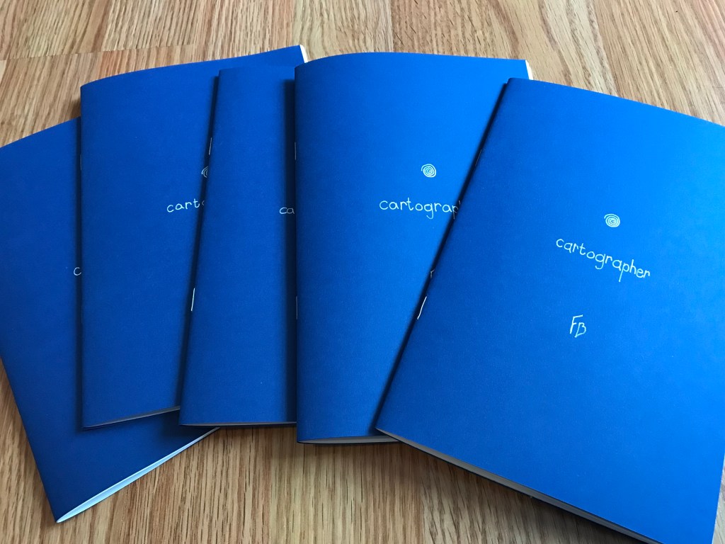
Having that imagined barrier of complexity removed, realizing that formatting for a booklet was just a simple function in Word, was massively inspirational. (Sidebar: I think convenience is under-appreciated as a motivating creative force—I first started writing short stories because I learned that to submit them to magazines, you just had to email them. No postage, no proposal, no agents. Good shit.) Over the next week, in idle moments I would open random old short stories and convert them into booklets, playing around with formatting and design. I eventually focused my efforts on “Cartographer” because that was the story that I was preparing to self-publish, so I figured I could distribute the physical edition shortly after I released it digitally.
After going through a long, overwrought trial and error process, I realized that there was a much simpler way to do it than the way I had just done it. You don’t even need word! As long as your word processor can set the page size and export to PDF, you can make booklets from any document. Heres how:
Set page size to 8.5×5.5 (or half the size of whatever paper you’re printing on, if different than US Letter.) Print to PDF. Open the PDF in Adobe Reader (that’s the free one, though I guess Acrobat works too?) and print it. In the print settings under Paper Sizing & Handling, select “Booklet.” As long as Binding is set to “Left” and Booklet Subset is set to “Both sides,” you’re good to go!
If you want to try this out, you could practice with this PDF of the Borges story “Tlön, Uqbar, Orbius Tertius.” The pages are already the right size, and 16 pages is a good round number for a booklet. Binding is tricky if you don’t have a booklet stapler (which is what I used for “Cartographer”), but this method works pretty well with a stapler of any size.
Future Print Projects
I have more ideas than I can really do anything with—there’s only so much time, and anyway all of this stuff is just fuss if there’s not an actual readership, so I’m focusing on cultivating that first. It would be cool to do a subscription service with 4 or 6 zines a year; it would be cool to have a letters column; it would be cool to have backmatter linking to other people’s zines; ah, the possibilities of print …
So yeah lots of castles in the air, but I can promise a couple things. 1st: I would like to do, in addition to zines, some single-sheet stuff. It turns out that if you format things in narrow columns, text is still quite readable even at 10pt font. Like, it isn’t even tiring on the eyes. (Essentially, I have made the brilliant discovery that has been the basis of all periodicals for as long as they have existed.) So short stories etc. up to around 2800 words can be printed on a single sheet of paper, as long as the margins are small. I think it would be cool to issue some stories or other things like this. Here is a 1-sheet version of my “manifesto for a speculative theatre,” as an example; you can print it yourself and see how it reads, if you have a printer.
2nd: The next one of these that I do, I will release for Public Domain Day 2023! (That is, Jan 1.) It’s a story about a printers guild; I wrote it without thinking about zines at all, but looking back on it, it is kind of a story about making a zine with your friends. I will be issuing physical copies of that for free as well, and posting digital downloads on the site. Celebrating the possibilities of print!
Spooktober 2022
That’s all for print talk. Now, to the books I’ve been reading! Every year around October I try to read a few horror(ish) books. This year I read Family Curse by Tenacity Plys, The Hole by Hye-Young Pyun, trans. Sora Kim-Russell, and Devil House by John Darnielle. Well, I haven’t finished Devil House yet, I’m still working my way through that one, though I can say I’m enjoying it a lot.
Family Curse was okay. The format is neat—nested records from different generations of a family, all dealing with an entity in the forest that periodically abducts their family members. One of the characters describes this as a “turducken” book. But the content within the format, the core of the palimpsest (which is fun and palimpsesty, I’ll grant), is just okay. Nothing really striking.

The Hole I also have middling feelings about, but in a different way. The dust jacket synopsis of this book is pretty compelling: a guy named Oghi survives a car crash which killed his wife; he wakes up paralyzed, his mother-in-law is his only caretaker; from his bedroom window, he can see that she’s started uprooting his wife’s old garden, and is digging a pit. The problem is, the book is more than halfway done before that synopsis actually starts to play out. We get too much time with Oghi just in the hospital, and too much time with his kinda shitty live-in nurse. The book is only about 200 pages, but it should’ve been more like 120. The core image and scenario is so potent, I honestly think it could’ve been even shorter than that, like short story-length.
Essentially, the horror trappings are solid, but the lit-fic trappings are very slack. This is not helped at all by the bland prose. I don’t know if it’s bland in the original Korean, but certainly Sora-Russell’s translation is dull.
With all that said, once the book reaches the point where Oghi’s mother-in-law is the only one taking care of him, it gets very good, and I read the final third of it in one sitting. The ending is perfect. I mean I am always going to love the image of A Big Ominous Hole, so if that does not intrigue you then there really is nothing here for you. If it does, well, maybe you’ll like this book.
My final word on The Hole is that the design choice of having a big black circle on the first page of each chapter, which gets bigger each time, is phenomenal. Bravo to designer Erin Seaward-Hiatt, really wonderful job. Oops—I’m talking about the possibilities of print again.
Thanks for reading! As I said, these zines are still available, so hit me up if you would like one. Next post will probably be Public Domain Day. Hasta luego!

That looks really interesting! – I’m intrigued to try it w/ some biology manuscripts or short review …
do it!
Francis!
I’m really intrigued by the little bit I’m just getting around to reading. I think it’s a tactile thing. I guess I’m old fashioned about preferring print to e-reading. Likewise, my aging eyes seem to prefer it. Anyway, I would very much like to purchase a copy of your zine Cartographer if there are any still available. Let me know how to make it happen. BTW, do you accept PayPal?
Francis, I am enormously proud of you and your writing. Keep on keeping on!
Happy Thanksgiving! Sending love,
Kathryn