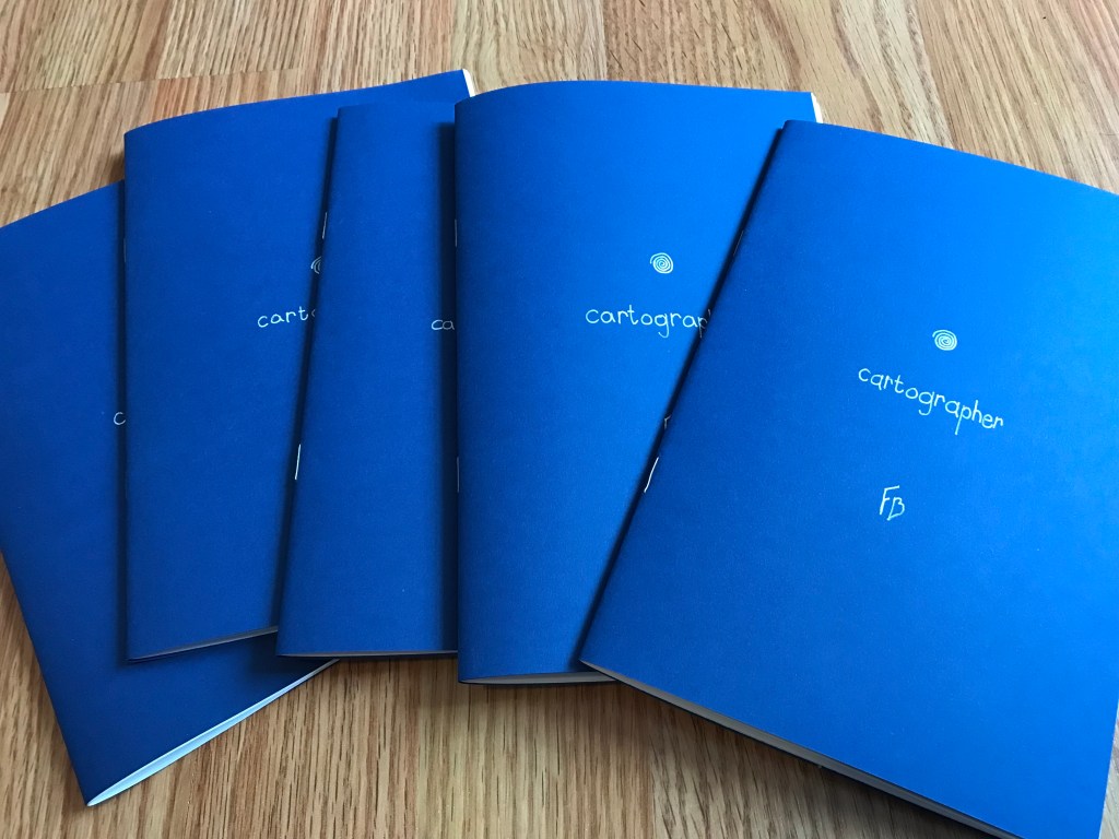
This post was originally just an unlisted page on my website, exclusively accessible through a QR code in the back of the print edition of “Cartographer.” But I think the ideas here may be of general interest, whether you’ve read “Cartographer” or not, so with some modifications I’m posting it to the blog!
Contents
The Possibilities of Print
So my first major premise is that reading on a screen sucks. It sucks because a lot of people already spend most of their day staring at a screen. It sucks because you are staring into a light source. It sucks because that light source is always refreshing, shooting 60 images at you every second. It sucks because there is other stuff on that screen that can distract you—even if you are good at focusing, notifications can still pop up depending on the device. (I do see the irony that you are reading on a screen right now—but I think these annoyances are more tolerable for short texts.)
E-readers are the exception. Although it’s still a screen, most e-readers use e-ink displays, not LCDs. The display reflects light, like paper, rather than shining it at you, and it has a much lower refresh rate—the text just sits there, stable, until you “turn” the page.
Turning pages in itself is another benefit of e-readers. There is some satisfaction gained with each page turn that is totally absent with scrolling. As I understand it, this is part of why kids’ books are printed with large text and broad margins—to provide a sense of accomplishment even when reading relatively little, relatively slowly. Each page turn is a little mile marker surpassed. Even as an adult, I find my brain switching modes depending on how much white space there is on a page. Big, chunky paragraphs: serious reading ahead. Dialogue and two-sentence paragraphs: yes lets go fast fast fast!
With all that said, there are two problems with e-readers, from a writer/publisher perspective. First, not everyone has one. I read a ton, and have done so for a while, and I only just got my first e-reader a few months ago. They can be pricy, at least compared to the free pair of eyeballs in your head.
The second major issue is that ebooks are a pain in the ass to design, and you basically can’t guarantee they will look nice across multiple devices. Ebook files are like html files, in that they are meant to display the same content across multiple different devices and apps. The content stays the same, but the style and layout might shift. E.g. Chapter 4 of a .epub may start on page 100 on a computer, page 200 on a phone, and page 150 on an e-reader. That’s pretty minor, but there are bigger issues when it comes to style. “Keep with next” doesn’t seem to work, ever. Drop Caps look dramatically different across different devices, with the one commonality that they all look equally jank (check out this article about it and scroll down to the example screenshots.) Why do websites look good and consistent across devices, and ebooks don’t? My guess is that it’s because the corporations selling the e-readers do not want cross-compatibility. Amazon even has its own file format. There is no effort at coordination, no effort to make an ebook look good if it wasn’t purchased through the given e-reader’s marketplace. I guess people think books are just text, and who cares about the container.
Well, I care about the container! Sitting on a park bench and unfurling a risograph-printed brochure to read about architecture, I can tell you from experience, it rules. The same text on a computer screen in my stupid bedroom, or on a phone screen at my stupid job—that would not rule. The text can still be very good. It can be transcendent, and someone reading it can recognize and appreciate it as such. But the actual reading experience will be worse. (For instance, I read most of Rebecca Solnit’s Men Explain Things to Me on the Bluefire Reader mobile app [barf] during rehearsals. Great book, awful way to read it.)
Read More »