Mark your calendars, Philadelphians! November 1st, 11am-5pm, in Temple University’s Mitten Hall, I will be tabling at Philly Zine Fest! This will be my first time attending a zine fest as a vendor, and I’m very excited. Some things I’ll be selling:
- All my previously published zines, to wit:
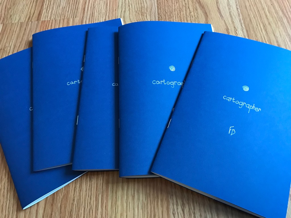
- “Cartographer”
- “Fires Burn Forever in this World”
- “Is Magic School Still Worth It?”
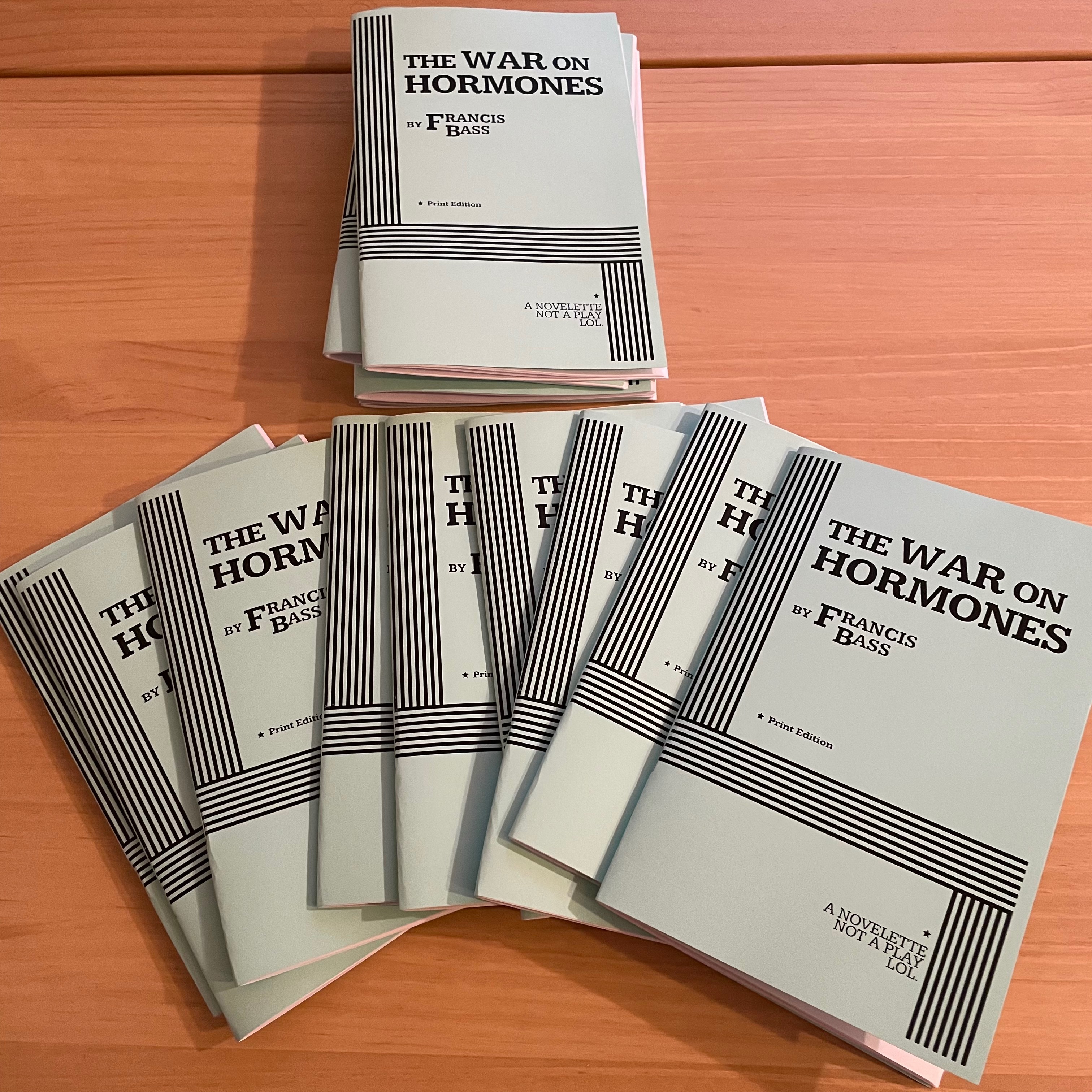
- “The War on Hormones”
- Lonely Friends
- A brand new zine about making a map!
- Brand new goblin stickers from some of my goblin week drawings!
- And a couple free things:
- “Masters of the Wine Printers Guild” zine
- “Just Dig” 1-sheet
If you are in the Philadelphia area please come by and say hi!
If you’re not able to make it, most of my zines are available on my Etsy, and sometime in November I’ll have the stickers and the new mapmaking zine up there, too.
Some other updates
The main thing I’m working on these days is a comic, One-on-One. I’ve drawn and inked about 20 pages (still need to “color” them in), and I expect the rest of the comic will be another 20 pages. Here’s a few sneak peaks. I hope to be finished with it by the end of the year, and have physical and digital editions up for sale.
On the reading front, I’ve finished Battle Hymn of China by Agnes Smedley and can at last move on to the actual sci-fi books on the list, starting with The Dispossessed by Ursula K. Le Guin. I’m over a hundred pages into it now and really enjoying it.
Battle Hymn of China was good, and I’d definitely recommend it to anyone who read and enjoyed Daughter of Earth. It’s not as novelistic as that book, much more episodic. Reading all the chapters together, they don’t combine or build on each other too much, but there are a lot of really fascinating episodes.
That said, I’m going to put my utopia/dystopia reading list on pause in October so that I can engage in my annual tradition of reading horror books for the spooky season. This year I plan to read:
- Never Whistle at Night, edited by Shane Hawk and Theodore C. Van Alst Jr.
- No Gods, No Monsters by Cadwell Turnbull
- A Scout is Brave by Will Ludwigsen
- And perhaps, if I have time, Strange Pictures by Uketsu, trans. Jim Rion
Look forward to a post about that 🎃. You can see my previous Spooktober posts here.